The story behind Maison Lafargue brand identity
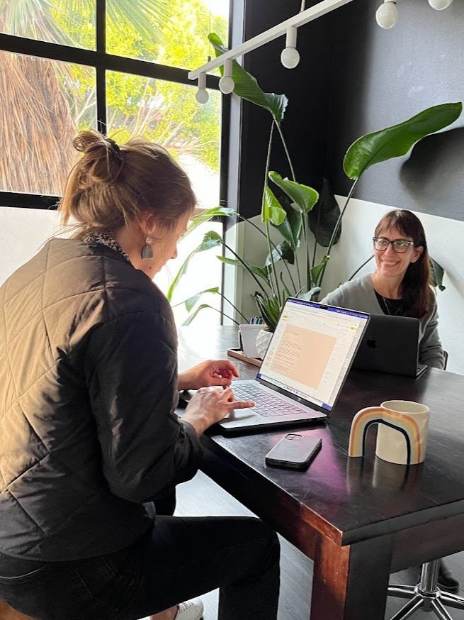
Working session at Pact Studio to build our brand identity
Building a personal brand can be intimidating.
How much of my personality, values and beliefs do I want to infuse in my business?
Should the name be conceptual or should I use mine? How do I keep it relevant over time?
To navigate these questions and build a thoughtful brand, I decided to reach out to my friends at Pact Studio.
Here is a glimpse at our journey.

Naming
I have been a marketer in very large and very small companies, supporting amazing founders on their path to success. Creating a boutique agency is my way to scale my mission of forging sustainable startups. It's deeply personal, so it has to be my name: “Lafargue”.
Additionally the name Lafargue comes from an ancient word from Brittany, designating people working in a forge or smithy - that cannot be a coincidence.
But naming was not about being egocentric. Quite the opposite.
“Maison” means “house” in French. For me, the word evokes a sense of place, of comfort and support, the qualities that I want Maison Lafargue to represent.
Because leading a startup can be lonely, exhilarating but also stressful, Maison Lafargue aspires to be a place where you can find support, access a network of skilled, like-minded partners and create deep relationships.
Personality
To define the brand personality, I put together two distinct moodboards.

The first one was muted and quiet, while the second was more colorful and energetic. The Pact Studio team smartly commented that my brand should set expectations for my customer experience. It was then pretty obvious that beige and quiet did not fit my brand personality, so we used #2.

List of values and traits for Maison Lafargue
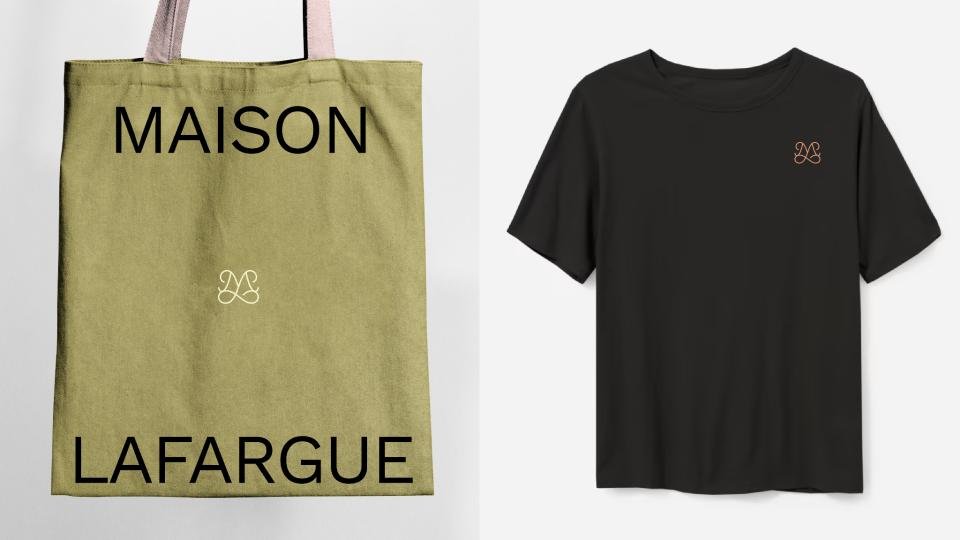
Logo, word mark, monogram
I instantly fell in love with the custom-made monogram. It had both strength and softness.
The logo combines the letters M & L to create an elegant, easy, and flowing monogram.
It is paired with a selection of mostly earthy colors that still deliver a nice dose of vibrancy and energy, and a combination of two font families: Work sans-serif and the beautiful Carefree serif designed by the independent type foundry Jen Wagner. Using a unique font makes a big difference in creating a remarkable visual identity.
All these elements come together to create an identity that combines the hard-working with the easy-going, the structured with the comfortable, the strategic with the creative.

Maison Lafargue brand kit
Application and evolution
I now feel like I have my own language, that I can access easily every time I want to create content or interact with customers.
It makes my daily productivity tools more pleasant to use (yes to spreadsheets, slides and decks templates!) and once integrated with Canva they help me create much faster.
I also know a brand is a living organism and it will evolve over time, like individuals and businesses do.