4 Data visuals that make a message stick
Data visualization is a powerful tool for communicating complex ideas in a clear, impactful way. Whether you're tracking progress on key initiatives, demonstrating ROI, or clarifying product positioning, the right visuals can make your message more engaging and easier to understand. In this post, we explore some excellent examples of data visualizations from Speed & Scale, Pyn, Anthropic, and Tesla.
Progress tracking and OKRs
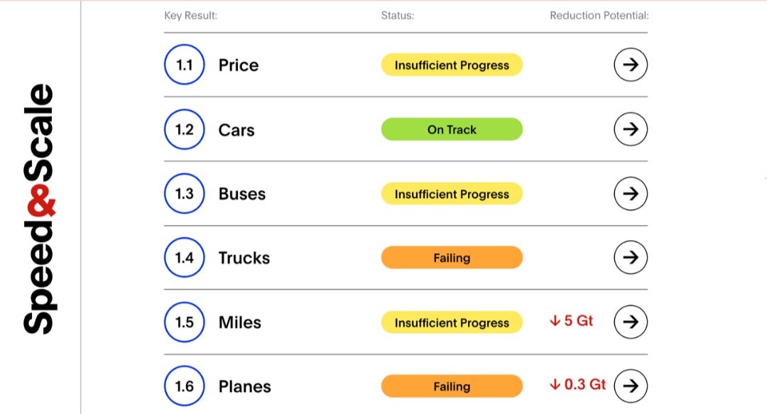
What: Speed and Scale is an initiative co-founded by John Doerr to accelerate the adoption of sustainable practices and technologies for a livable planet. It has identified 10 areas and is tracking our progress toward specific KPIs.
Credit: Speed and Scale, speedandscale.com/tracker
Why it’s impactful: The global climate tracker provides objective metrics for a highly emotional problem. The visual style is clean and structured, making it easy to assess the situation across many dimensions.
How you can apply it: Show your business progress with a minimalist design that simplifies complex topics. Use familiar color coding to make your visualizations instantly recognizable and easy to understand.
ROI tool
What: Pyn helps companies design a customized employee journey map. Their ROI tool assesses savings related to the reducing administrative, manual work, and communication tasks, as well as increased efficiencies and productivity.
Credit: PYN, pynhq.com/roi
Why it’s impactful: As many HR teams streamline their tech stack, showcasing a credible ROI is crucial. The sleek design of Pyn’s ROI tool—ungated and paired with a clear narrative —makes it extremely user-friendly and shareable.
How you can apply it: Build a data-driven value model of your solution, test it with trusted customers, and use it as a lead generation or conversation tool. A well-designed ROI calculator can be a game-changer in demonstrating value.
Product segmentation
What: Claude is Anthropic’s AI model, available in different versions with creative names like Haiku, Sonnet, and Opus. The visualization shows the cost/performance ratio of each model at a glance.
Credit: Anthropic, anthropic.com/claude
Why it’s impactful: This simple yet effective visualization helps create awareness and understanding of the individual positioning of each model. It’s an easy and memorable way to communicate your product offerings.
How you can use it: Define your X/Y axes and consistently position your products. A well-crafted segmentation chart can clarify your product lineup and help customers quickly identify the best option for their needs.
TCO and competitive positioning
What: The Tesla 2023 Impact Report includes a detailed Total Cost of Ownership (TCO) calculation. As electric vehicles gain popularity, there’s often confusion around pricing, incentives, and maintenance costs. Tesla’s TCO calculation offers clear and concise data to address these concerns.
Credit: Tesla, 2023 Impact Report
Why it’s impactful: This visualization provides a holistic and straightforward way to understand the value of EVs, offering an apple-to-apple comparison between competitive options.
How you can use it: Articulate your TCO clearly and educate your buyers to think beyond initial costs. A well-presented TCO analysis can demystify your product’s value and drive informed purchasing decisions.
Conclusion
Data visualizations have huge potential to bring our content to life, making our messages not just more engaging but easier to grasp. By using these visuals well, we can reshape how we share information and really connect with our audience on a new level.


